-
About University
- Mission & Brand Strategy
- University Leadership
- Rector's Welcome
- History
- Regulatory Documents
- Contacts
- Staff
- International Recruitment
- Partners
Applicants- Why Sechenov University
- Degree Programmes in English
- Preparatory Courses
- Non-Degree Programmes
- Transfer from other Institutions
Mission & Brand Strategy
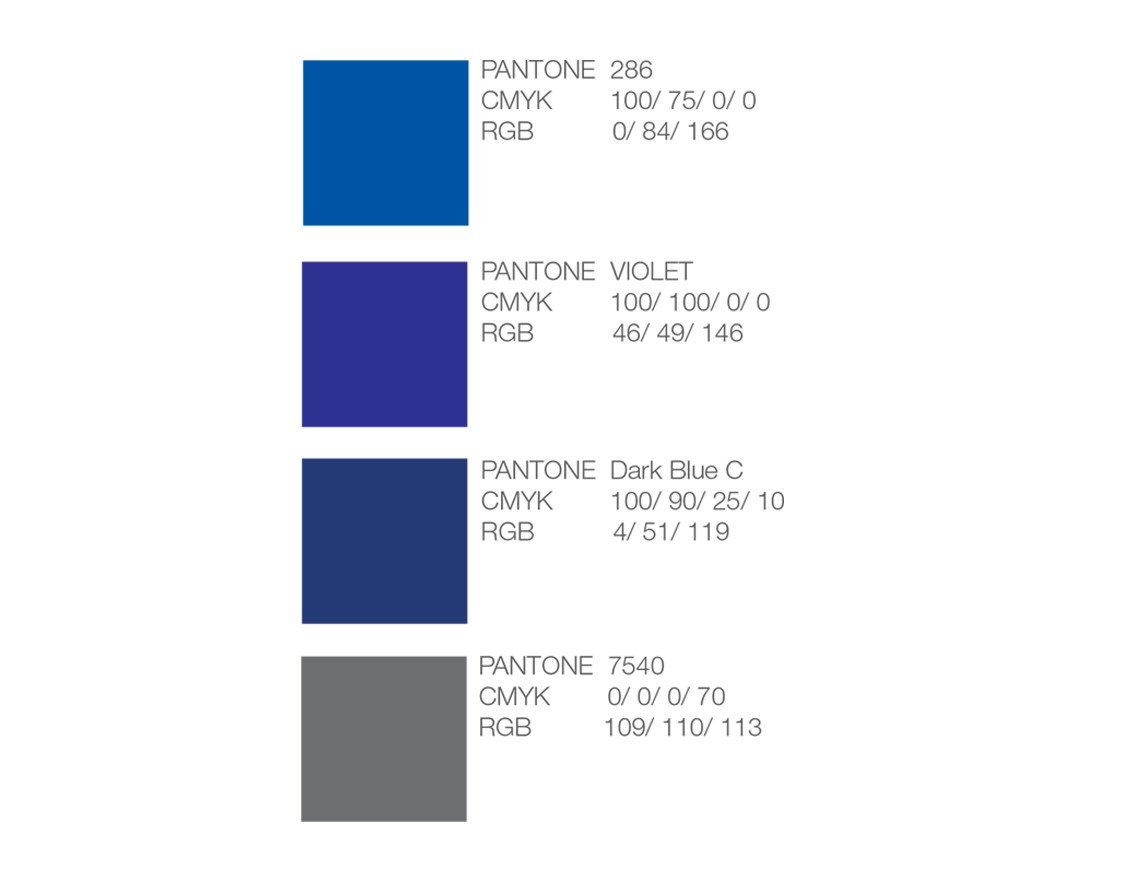
Primary Colour Palette
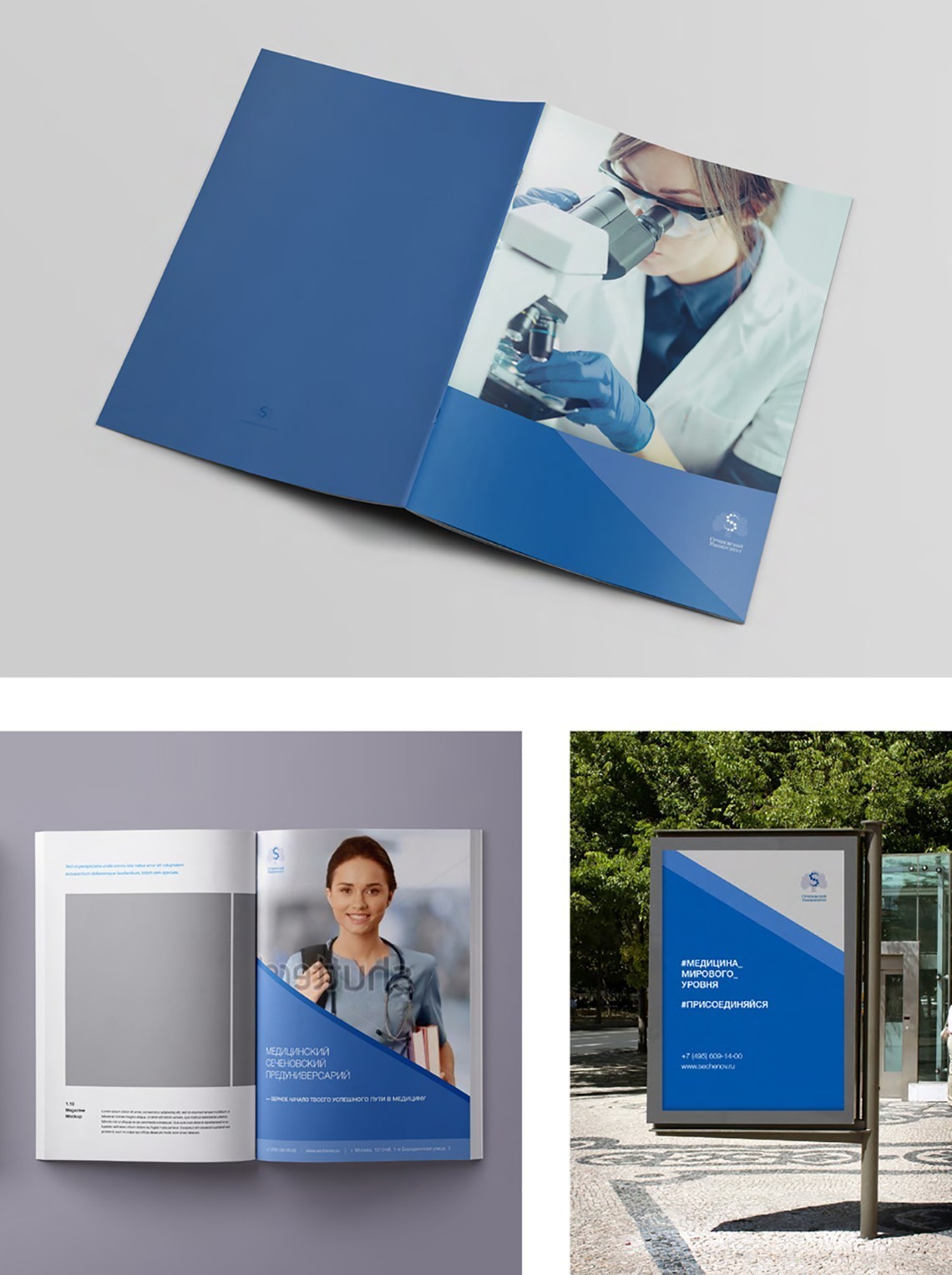
Our brand colours are light blue, dark blue and grey. They can be used in different combinations. The light blue colour (100:75:0:0) is used in all types of business documents, backgrounds, headlines, as the primary texture colour and in printing jobs. Dark blue tints are used as secondary colours. They cannot be used in headlines.
Primary Colour Shades
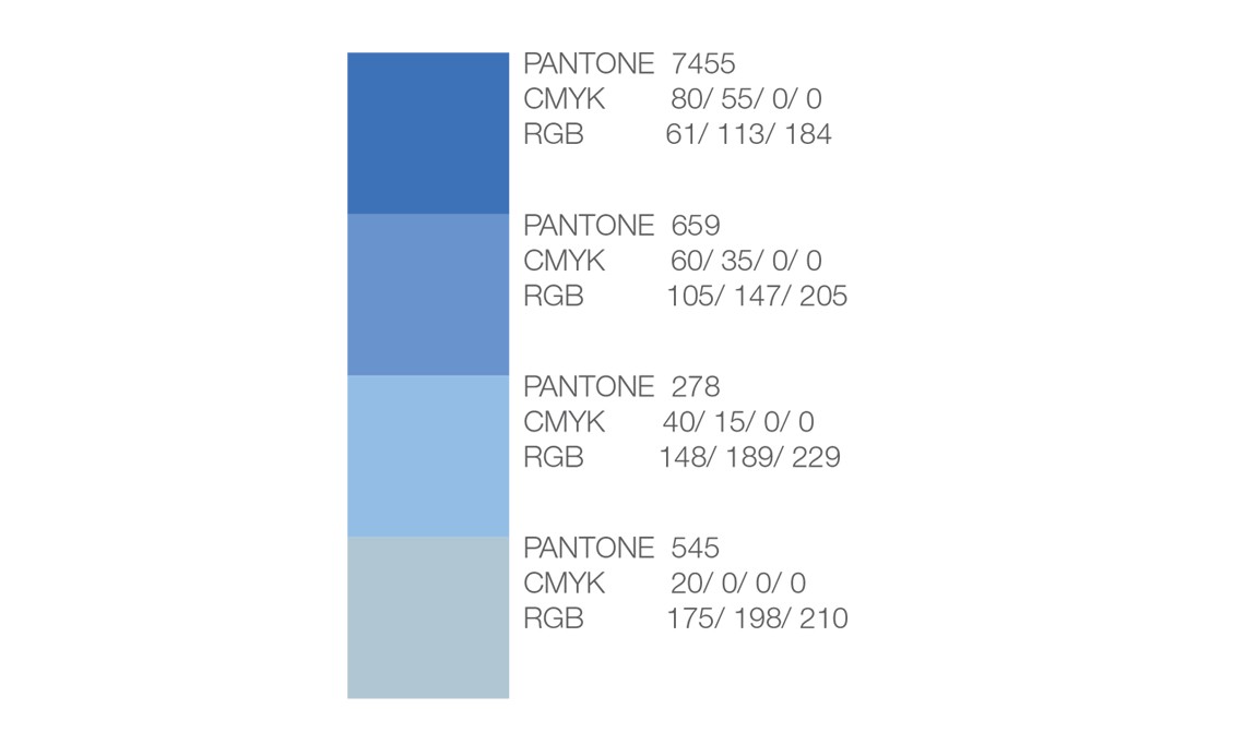
The grey colour (0:0:0:70) is used as the primary typeface colour. Grey tints are used as secondary colours of the linear texture and as patches of solid colour.
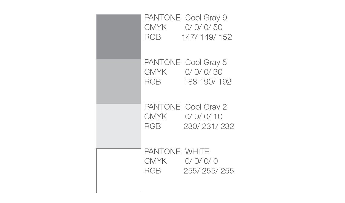
Usage of Primary and Secondary Colours and Their Tints in Printed Products
Combination of Text and Colour
Primary dark blue colour can be used apart from the classical black typeface. It is recommended to avoid using shades of the primary colour in the text body.
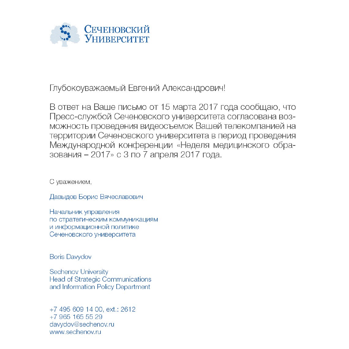
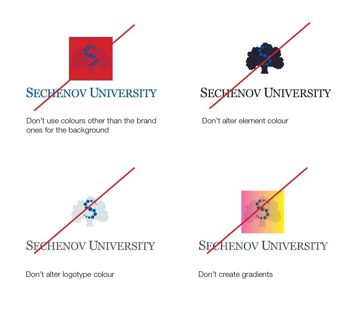
Incorrect Usage
