-
About University
- Mission & Brand Strategy
- University Leadership
- Rector's Welcome
- History
- Regulatory Documents
- Contacts
- Staff
- International Recruitment
- Partners
Applicants- Why Sechenov University
- Degree Programmes in English
- Preparatory Courses
- Non-Degree Programmes
- Transfer from other Institutions
Mission & Brand Strategy
Sechenov University logo is built upon the idea of a combination of commitment to tradition and passion for progress in research.
A tree as a symbol of life, nature, growth and wisdom brings together two ideas: progress (growing branches, leaves and buds) and a strong bond with traditions (the roots).
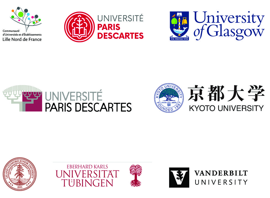
Over the centuries, the tree has more than once shown up in the emblems of internationally acclaimed universities (Stanford University, Vanderbilt University, Kyoto University, University of Glasgow, Paris Descartes University, University of Tübingen etc.).

However, our tree is not figured in the typical way. Rather it represents a fusion of fine parallel lines. This graphic structure at once gives lightness to the otherwise heavy structure of the tree whilst also underlining its secondary, background character. The fine lines showcase the precise skill of the physician as an attentive, responsive and meticulous virtuoso whose work is no less than an art.

The circles it incorporates denote numerous University subdivisions which organically interact with each other, collectively forming a single structure.
The university logo illustrates both preservation of traditions of the Russian medical school and an innovative future-oriented approach.
Owing to its structure, the logo leaves room for a rich graphic variability which can be used to strengthen the University’s single brand as a complex multicomponent research, education and clinical hub, acclaimed worldwide.


